Logo Design // STAG
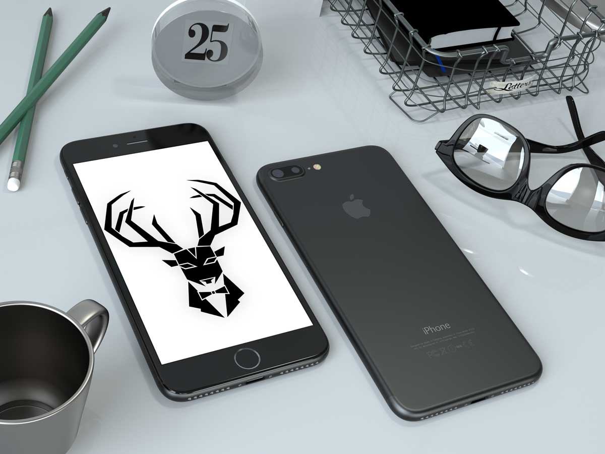
Steps To A Gentleman
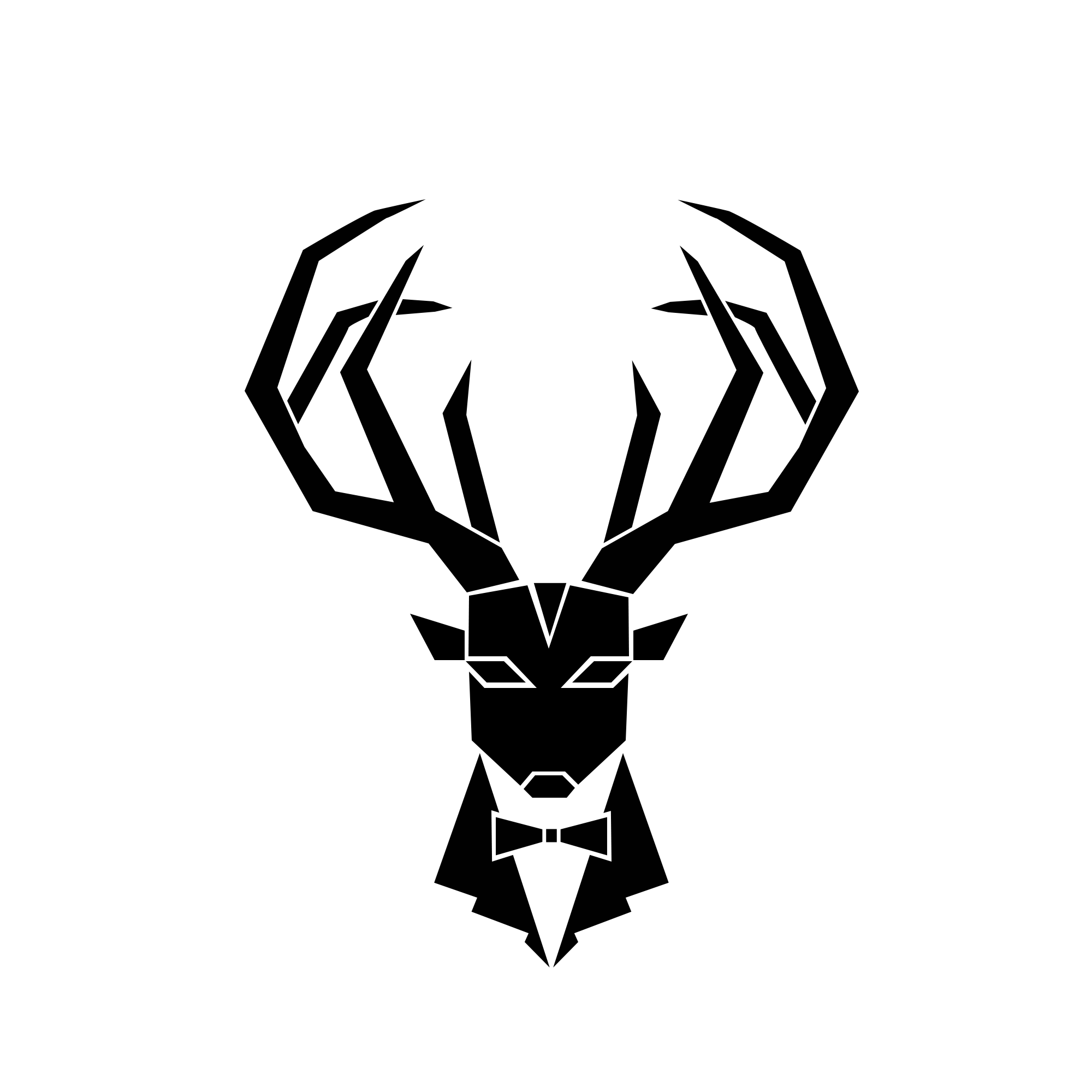
The Logo for Steps To a Gentleman was a collaborative project with the site’s creative director. He wanted something that exemplified an air of sophistication and masculinity mixed with a modern graphic vibe. We also wanted to work with the image of an actual stag animal, playing on the initialism of the brand, STAG.
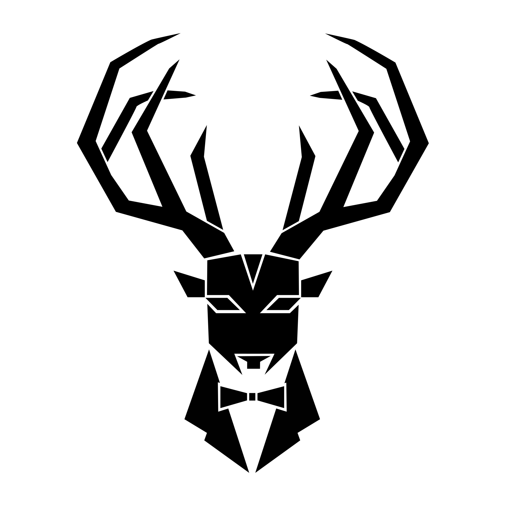
With a few well-placed lines, we are able to tell a story that exemplifies the feeling and the vibe of the brand to onlookers before they even know what the brand is.
We came up with a logo that is both strong and elegant, and simple yet memorable. The logo comes in both black and white and a tri-colorway and can be replicated with ease whether he needs it digital, embroidered, silk screened or blown up or shrunken down.
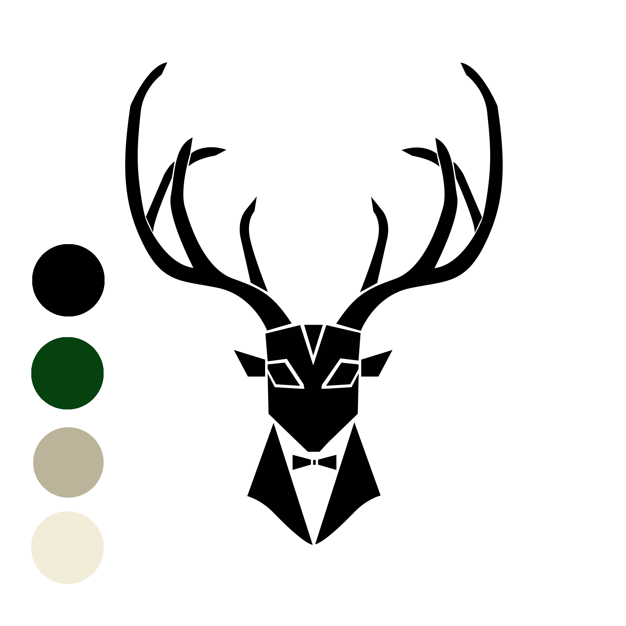
The final logo in it’s tri-colorway
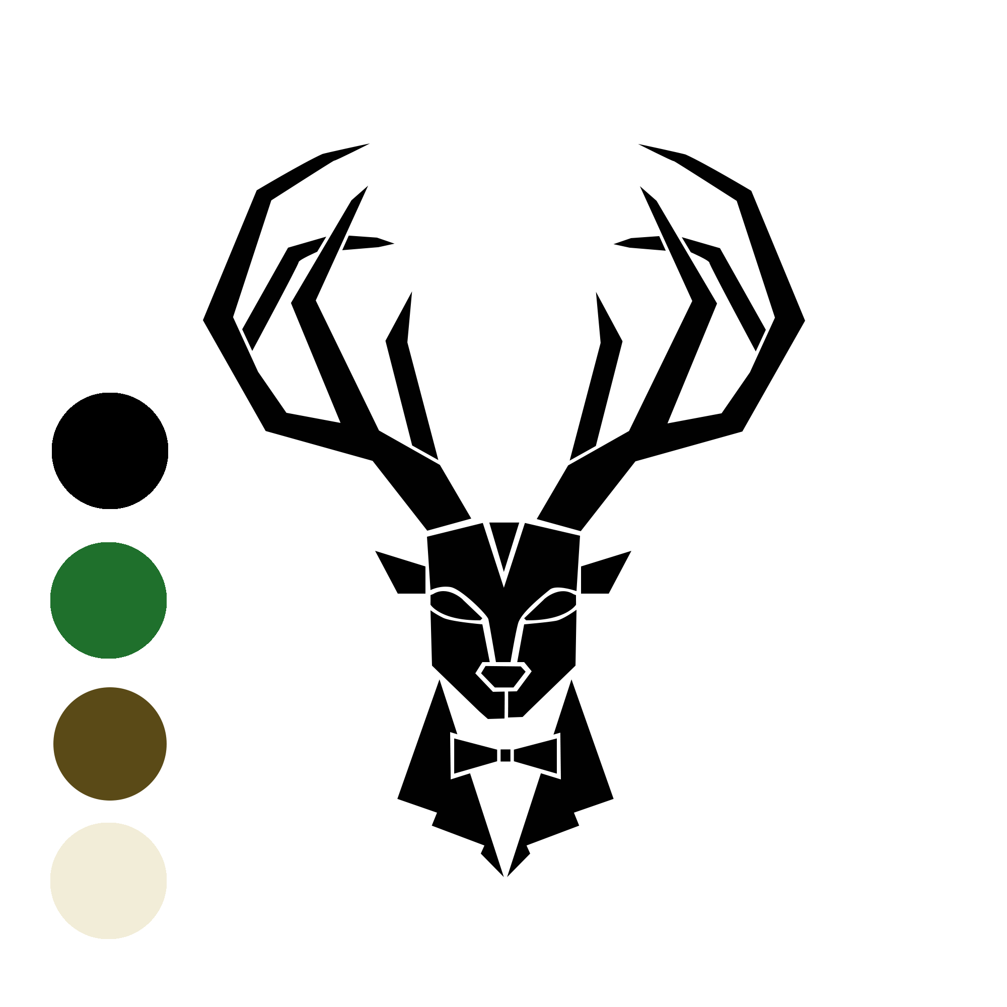
LOGO ROUGHS:
Sometimes it all comes down to a couple mm to make the graphic just right. It’s worth the time to focus in on those details and make it perfect.
See more logo projects here